Pastel hues have long carried an unfair reputation. Many homeowners associate soft pinks, pale blues, and minty greens with childhood bedrooms or overly sweet aesthetics—visions of cartoon characters and plastic furniture that feel miles away from the curated, intentional home you envision. But here's the truth that design professionals have known for years: interior design pastel colors can be extraordinarily sophisticated when deployed with intention and restraint.
At Skonne, we believe in the power of Nordic minimalism to transform everyday spaces into havens of calm. This guide reveals how to embrace soft, dreamy hues without sacrificing the elevated aesthetic you crave. Whether you're drawn to muted pastel palettes for your living room or seeking soft color home decor for a complete refresh, the key lies in understanding how Scandi sensibilities elevate these gentle tones from playful to purposeful.
Why Pastels Feel Childish (And Why They Don't Have To)
The association between pastels and childhood stems from decades of saturated, primary-tone applications in children's products and spaces. When pastel room ideas are executed with high saturation, shiny finishes, and cluttered compositions, they inevitably read as juvenile. But the modern approach to pastel interior design flips this script entirely.
Childish pastels are bright, glossy, and standalone pieces. They scream for attention without context. Sophisticated pastels, by contrast, embrace intentional restraint: muted undertones, matte or textured finishes, and integration with natural materials like oak, linen, and unglazed ceramics. The difference isn't the color itself—it's how you frame it.
This distinction becomes clearer when you consider the Scandinavian design philosophy. Nordic interiors have long employed soft color interior design principles to create spaces that feel warm yet restrained, personal yet timeless. The pastel home decor that emerges from this tradition doesn't compete with your space—it completes it.
The Scandinavian Approach to Sophisticated Pastels
Scandinavian design offers the perfect framework for integrating pale hues without sacrificing sophistication. The Nordic aesthetic prioritizes functionality, natural light, and material honesty—principles that transform even the sweetest pink into something architectural and refined.
The 60-30-10 Rule for Soft Dreamy Colors
Professional designers often reference the 60-30-10 guideline when building color palettes. For modern pastel interiors, this translates to:
- 60% neutral foundation (warm whites, soft grays, natural wood tones)
- 30% supporting hue (a single dominant pastel like dusty Rose or sage Green)
- 10% accent color (a complementary or contrasting touch introduced through lighting and decor)
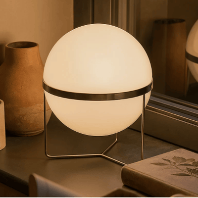
This disciplined distribution prevents any single color from overwhelming the space. Your Table Lamps in soft blush or dusty blue serve as that perfect 10%—offering gentle color moments without demanding center stage.
The Power of Texture and Material
Perhaps no element distinguishes sophisticated pastels from childish ones more than texture. A glossy plastic pink reads juvenile. That same hue rendered in kiln-glazed ceramic, brushed brass, or handblown glass becomes artful. The material tells a story of craftsmanship and intention that transcends the color itself.
For those exploring scandinavian pastel decor, look beyond painted walls. Seek out dyed textiles, tinted glass, and naturally patinated metals. These material choices signal sophistication because they require skill, time, and intention to produce.


Trending Pastel Colors for 2026
Design forecasters predict a continued embrace of muted color schemes through 2026, with specific hues emerging as front-runners for modern interiors. Understanding these trends helps you make choices that feel current yet enduring.
Baby Blue: The New Neutral
Gone are the days of bubblegum blues. Today's trending iteration features gray undertones and a dusty quality that pairs beautifully with warm woods and brass accents. This sophisticated pastels favorite functions almost as a neutral in well-lit spaces, offering just enough color to distinguish your walls from stark white without overwhelming the room.
Millennial Pink Evolved
The pink that defined a generation has matured. Contemporary interpretations lean toward terra-cotta undertones, creating warmth without sweetness. When paired with charcoal grays or deep greens, this evolved pink reads as architectural rather than decorative.
Buttery Yellow and Mint Green
These two pastels represent the optimistic side of dreamy interior hues. Butter yellow brings sunshine without the intensity of ochre or mustard, while mint green offers freshness without the clinical quality of true emerald or forest tones. Both work beautifully as accents in primarily neutral spaces.

Insider Styling Techniques for Pastel Rooms
Professional designers employ specific strategies to ensure pastel living room design and bedroom applications feel grown-up and intentional. These techniques transform soft color home decor from decorative afterthoughts to foundational elements of your space's personality.
Layering for Depth
Instead of introducing one pastel statement piece, consider building layers of similar tones. A pale blush wall paired with slightly deeper rose textiles and a hint of coral in your accessories creates tonal depth that reads as sophisticated. This technique requires restraint—working within a single color family prevents visual chaos while maximizing impact.
The Role of Negative Space
Scandinavian design teaches us that what you don't include matters as much as what you do. Pale wall colors need breathing room. Resist the urge to fill every surface with pastel accessories. Instead, let your soft tones occupy select moments—a perfectly placed vase, a sculptural pendant, a single accent chair—surrounded by generous whitespace and natural materials.
The video above demonstrates how designers balance softness with structure, using architectural elements to ground ethereal color choices.

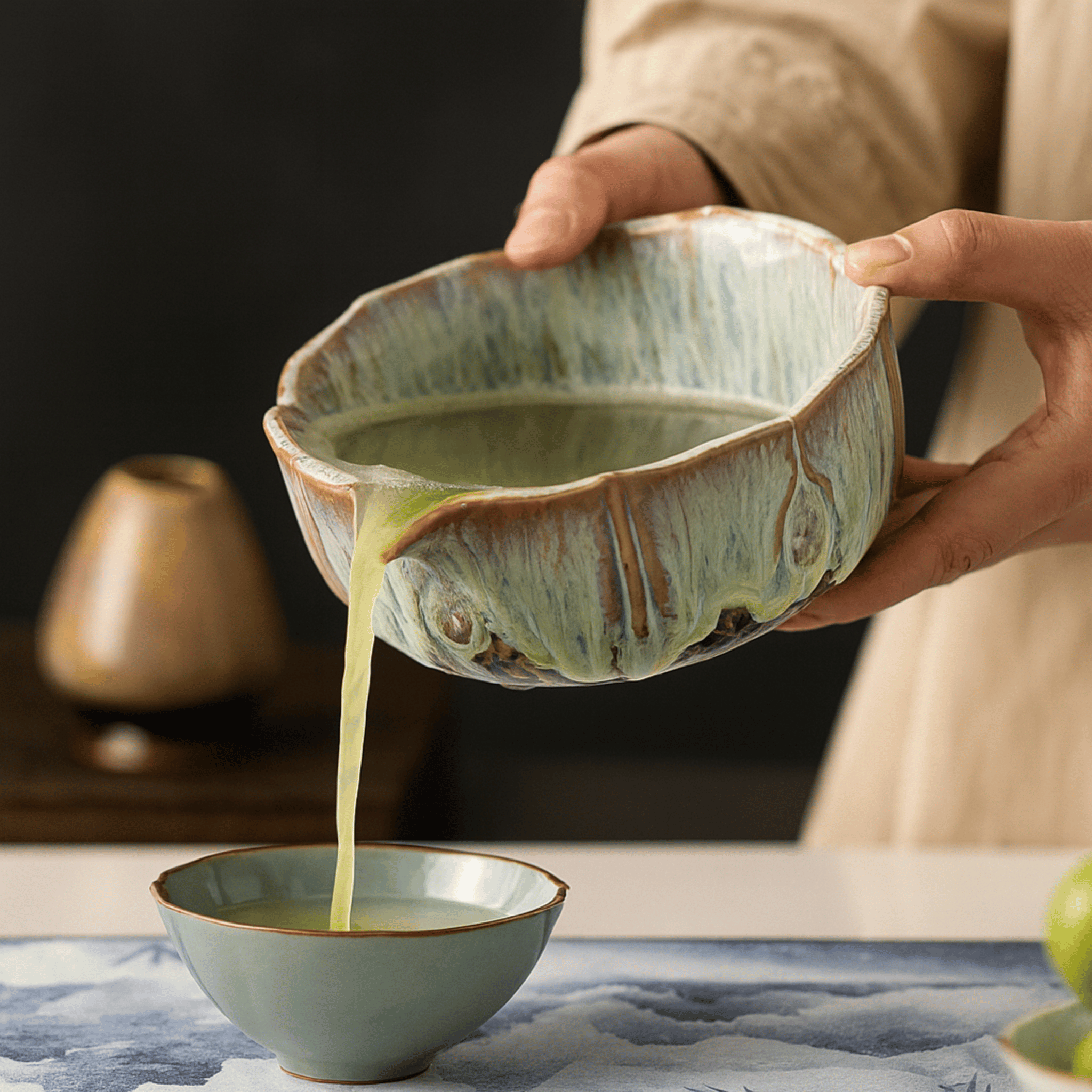
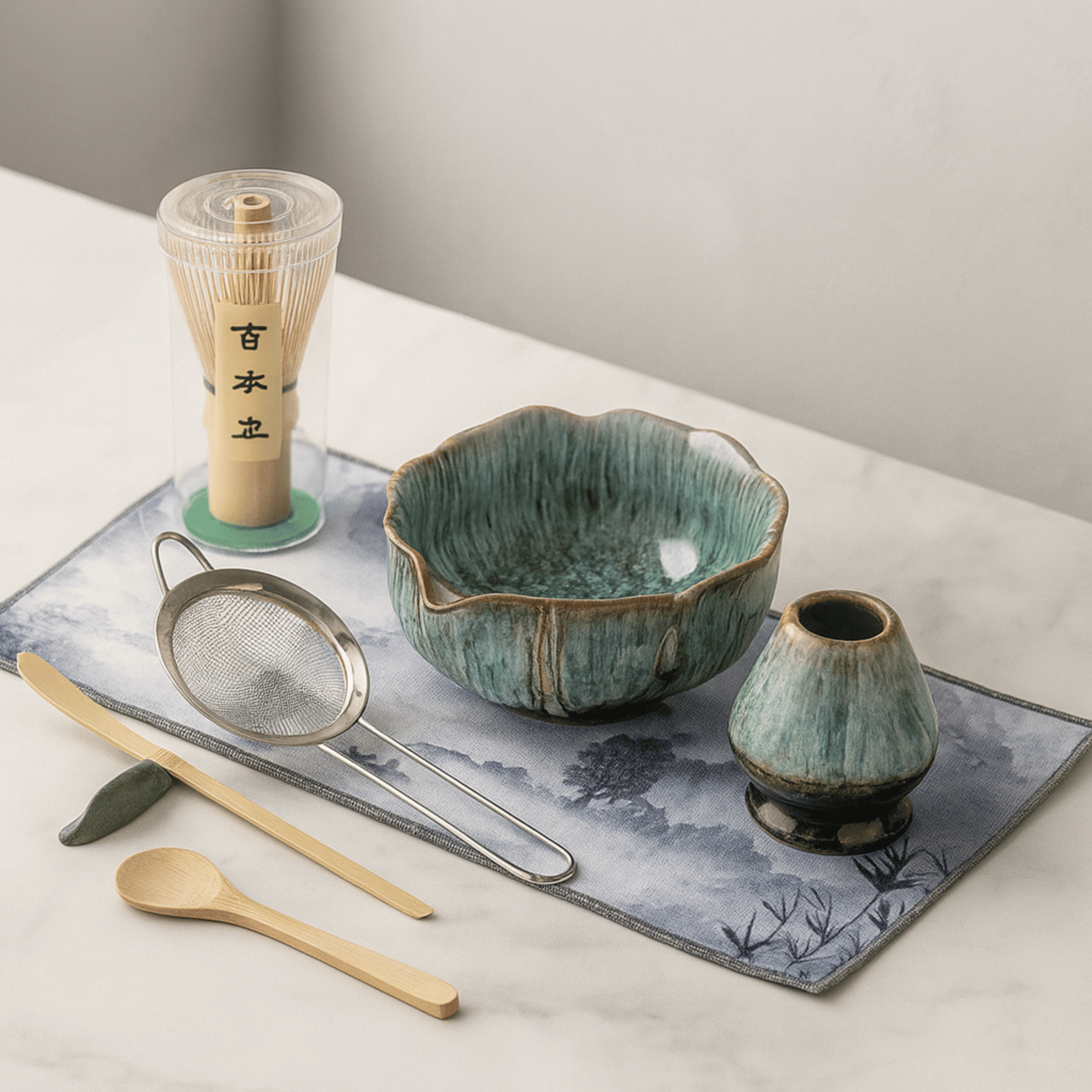
Blomva Kiln-Glazed Handcrafted Matcha Ceremony Set
$149.00 $219.00
Add artisanal warmth with the Glazed Pink variant—a handcrafted ceramic piece that brings sophisticated pastel charm to your kitchen counter or coffee table ritual.
Explore ProductMaterials That Elevate Pastels
The transformation from childish to sophisticated often happens at the material level. When you introduce interior design pastel colors through thoughtfully chosen materials, you signal discernment and intention.
Ceramics and Handcrafted Pieces
Handcrafted ceramics carry an organic quality that elevates any color they wear. The slight variations in glaze application, the subtle imperfections of handmade pieces, and the weight of quality clay—all these factors contribute to a sense of heritage and permanence. A soft pink vessel in matte ceramic reads entirely differently than the same color in mass-produced plastic.
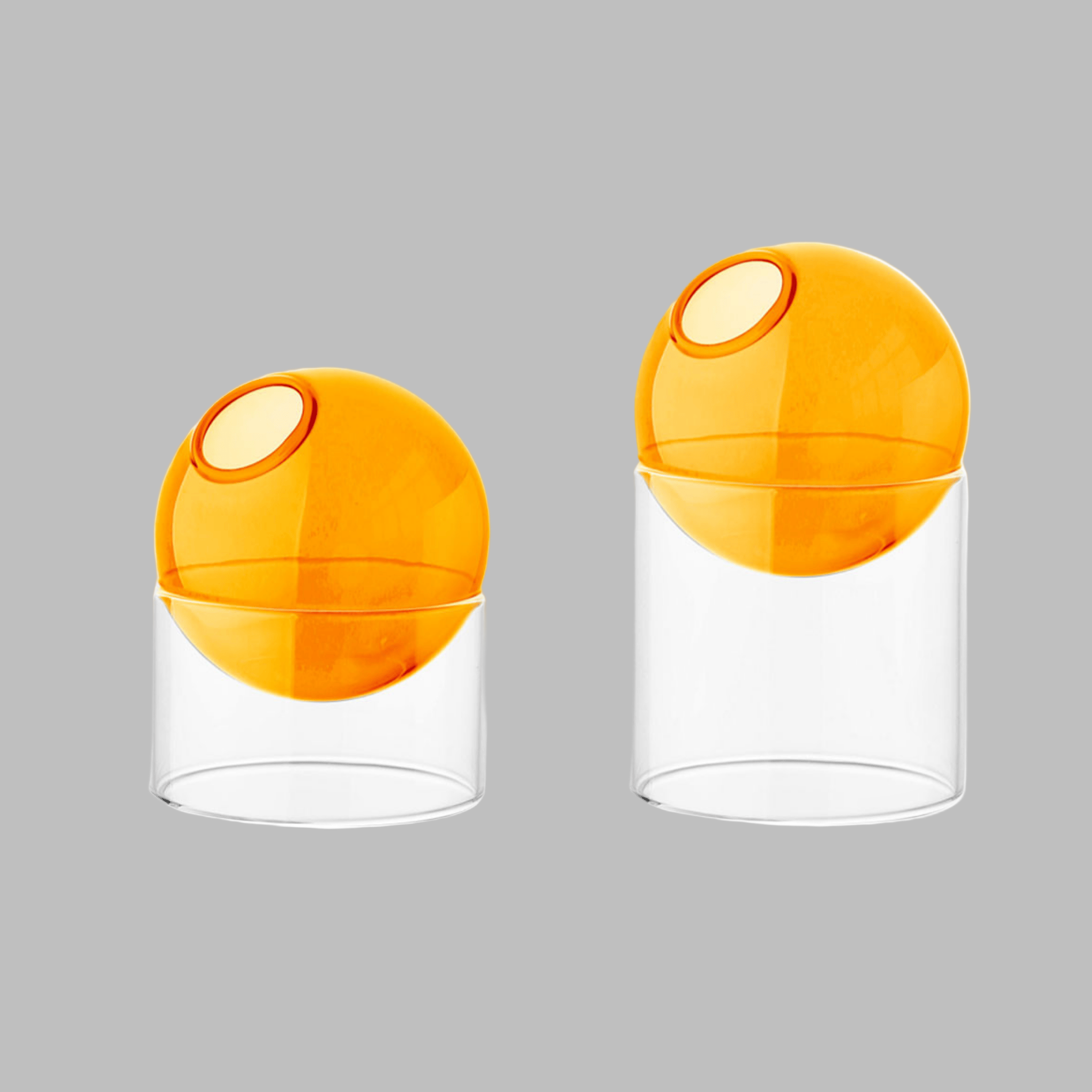
Glass and Resin
Tinted glass offers transparency and luminosity that flat painted surfaces cannot achieve. When light passes through pastel glass or resin, it creates soft, colored illumination that transforms a room's atmosphere. These materials work particularly well for lighting fixtures and decorative vessels.

The interplay between soft hues and natural surfaces creates the balanced aesthetic that defines contemporary Nordic interiors.
Pastel Lighting & Accents for Sophisticated Spaces

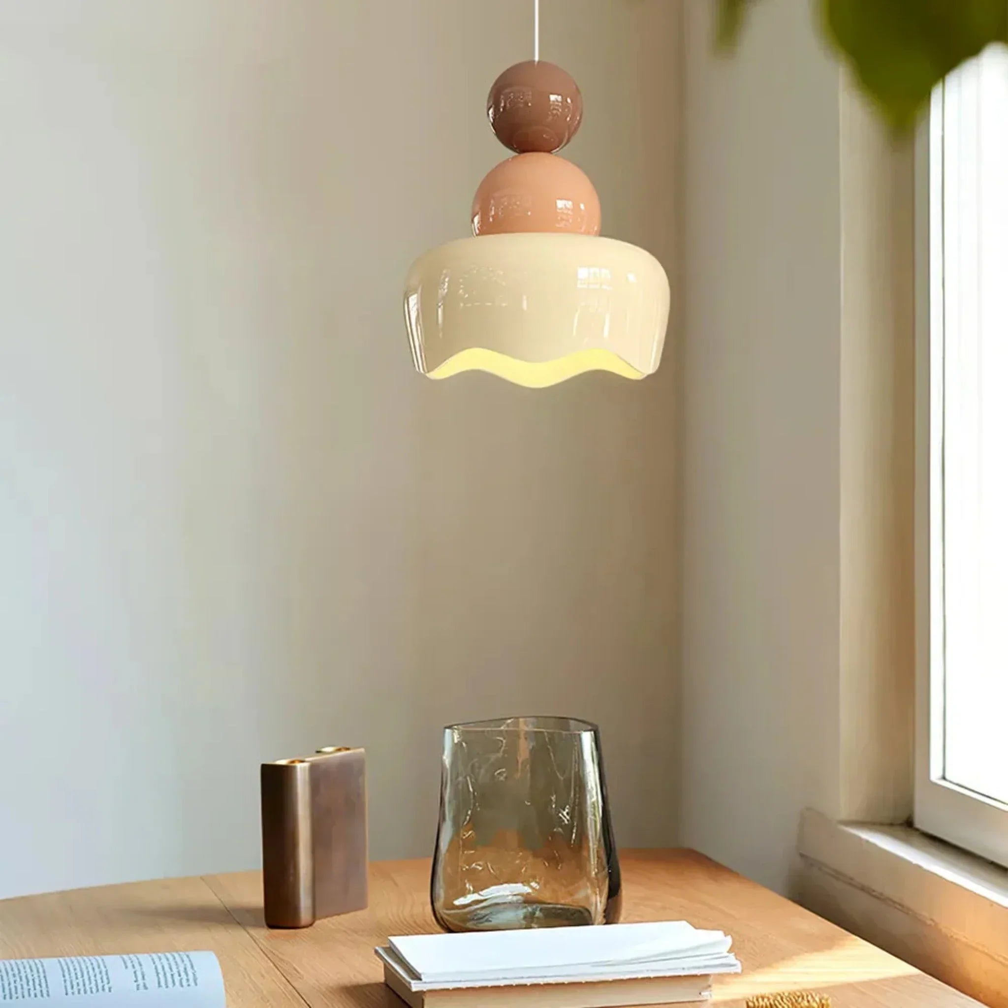
Ljuva Resin Glass Pendant Light Bedroom Decor
$159.00
$249.00
The Pink Resin option casts dreamy, diffused light—perfect for adding a subtle blush accent to bedroom corners or intimate dining spaces without overwhelming the palette. Learn more ➔

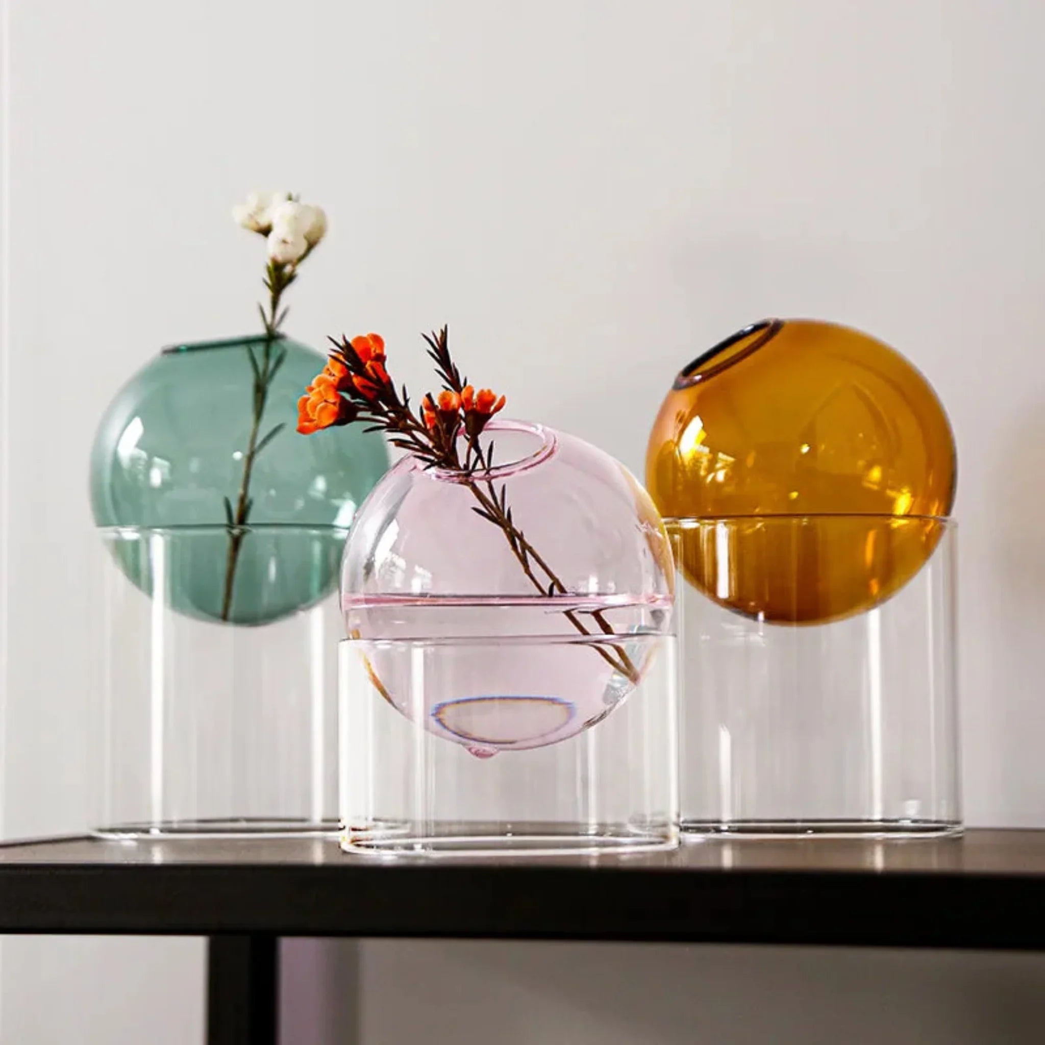
Vårka Borosilicate Round Glass Vase for Flowers
$38.00
$59.00
The Small Pink variant offers an affordable entry into pastel styling—an elegant borosilicate glass vessel that elevates shelves and windowsills with quiet sophistication. Learn more ➔

Room-by-Room Pastel Application
Understanding where and how to introduce soft color interior design throughout your home ensures cohesive, intentional results. Each room presents unique opportunities for pastel integration.
Pastel Living Room Design
The living room offers the most dramatic canvas for pastel experimentation. Large upholstered pieces in soft tones—think a blush linen sofa or mint velvet armchair—anchor the space with color without overwhelming it. Balance these investments with neutral walls and flooring, then introduce complementary pastels through lighting, rugs, and art.
The key to successful pastel living room design lies in treating soft hues as you would any other color: with respect for proportion, contrast, and context. A pale blue wall behind a charcoal gray sofa reads contemporary and intentional. That same blue behind white furniture can feel washed out or juvenile without sufficient grounding.
Bedrooms and Intimate Spaces
Bedrooms naturally lend themselves to dreamy interior hues. The soft, diffused quality of pastel tones promotes rest and relaxation. Consider pale wall colors as your backdrop, then layer on textiles in slightly deeper or complementary soft shades. The result should feel like a sanctuary—warm, enveloping, and distinctly adult in its restraint.
Kitchens and Dining Areas
These practical spaces benefit from pastel accents rather than dominant color applications. The strategic use of muted tones in kitchen and dining spaces, as explored by design experts, demonstrates how soft colors can enhance functionality while maintaining sophistication.

Bathrooms
Tile offers the perfect medium for introducing pastel hues to bathrooms. Soft mint or blush tiles, particularly in matte finishes, create spa-like atmospheres. Pair with brushed brass fixtures and natural wood vanities to ensure the space feels curated rather than thematically sweet.
Common Mistakes to Avoid
Even with the best intentions, certain pitfalls can derail your sophisticated pastels vision. Awareness of these common errors helps you sidestep them entirely.
Over-Saturation
The most frequent misstep involves using too many pastel colors simultaneously. Stick to one or two dominant soft hues per room, supported by generous neutrals. When every element carries color, the eye has nowhere to rest—and the space reads as busy rather than curated.
Ignoring Undertones
Not all pastels play well together. A pink with cool blue undertones clashes with a yellow-based pink. Before committing to multiple pastel pieces, examine their undertones in natural light. Cohesive undertones create harmony; competing ones create visual tension.
Neglecting Contrast
Soft color home decor needs contrast to shine. Without deeper tones to provide visual weight, pastel rooms can feel insubstantial. Black accents, deep charcoal, rich wood tones, or even verdant plants offer the necessary counterbalance that makes soft hues sing.
Conclusion
Interior design pastel colors offer remarkable potential for creating spaces that feel both fresh and timeless, gentle and grounded. The path to sophisticated pastel application lies not in avoiding these soft hues, but in embracing the principles that elevate them: intentional restraint, quality materials, natural textures, and disciplined color distribution.
At Skonne, our curated collection of Scandinavian-inspired lighting and decor embodies these principles. Each piece—from our kiln-glazed ceramics to our tinted glass pendants—represents the elevated approach to pastel tones that transforms rooms from sweet to sophisticated. Whether you're taking your first steps into muted pastel palettes or ready to fully embrace modern pastel interiors, we offer the intentional, quality pieces that help you achieve your vision.
Ready to transform your space? Explore our full collection of Scandinavian-inspired pastel home decor, where soft hues meet Nordic minimalism for endlessly livable, elevated interiors.
Frequently Asked Questions about Interior Design Pastel Colors
The 3-5-7 rule refers to the principle of using odd numbers when arranging decorative elements. Designers generally group items in threes, fives, or sevens because odd numbers create visual interest and asymmetry that feel more natural and dynamic than even-numbered arrangements. This applies perfectly to pastel styling—group three ceramic vessels in complementary soft tones rather than two or four for maximum impact.
Baby blue with gray undertones leads current pastel trends, functioning almost as a neutral while offering subtle color presence. Millennial pink has evolved toward terra-cotta undertones for a more sophisticated feel. Additionally, buttery yellow and sage mint green are gaining popularity for those seeking optimistic yet refined hues. The common thread among all trending pastels is their muted quality—dusty, grayed, or earthy undertones that prevent them from reading as juvenile.
Yes, pastel colors remain strongly positioned for 2026, but with an evolved interpretation. Rather than the bright, saturated pastels of previous decades, current trends favor muted, dusty iterations with gray or earth undertones. Design forecasters predict continued interest in sophisticated pastel palettes that offer warmth and personality without overwhelming minimalist sensibilities. The key for 2026 is integration—pastels work best as intentional accents within primarily neutral, natural-material-focused spaces.
The four foundational pastel colors are typically considered to be baby blue, blush pink, mint green, and buttery yellow. These soft iterations of primary and secondary colors serve as the backbone of most pastel palettes. However, sophisticated interior design increasingly embraces expanded ranges including lavender, peach, sage, and dove gray. The defining characteristic isn't the specific hue but rather the desaturation and white content that creates that characteristic soft, light quality.
To use pastels without looking childish, focus on three principles: material quality, color restraint, and contextual grounding. Choose pastels rendered in high-end materials—matte ceramics, tinted glass, brushed metals—rather than plastic or high-gloss finishes. Limit your palette to one or two soft hues per room, supported by generous neutrals. Ground pastel elements with natural materials like oak, linen, and stone, plus deeper accent colors for contrast. Finally, follow the 60-30-10 rule: 60% neutral foundation, 30% supporting pastel, 10% accent color.