Standing in the middle of a room you want to transform can feel both exciting and overwhelming. You envision a space that feels cohesive, intentional, and uniquely yours—yet figuring out where to start often leaves you staring at blank walls and wondering which decisions actually matter. Mastering essential interior design techniques is the bridge between that initial uncertainty and creating rooms that feel like home.
Throughout this guide, you'll discover the fundamental principles professional decorators rely on daily, from the 60-30-10 color rule to the art of layering light. Whether you're refreshing a single corner or completely reimagining your living space, these proven methods will give you the confidence to make decisions that elevate your home. And as you'll see, having access to thoughtfully crafted lighting and decor pieces—like those we curate at Skonne—can transform these techniques from theoretical concepts into tangible, beautiful reality.
What Are the Core Interior Design Techniques?
Before diving into specific rules and ratios, it's essential to understand what we mean by interior design techniques in practice. These are the systematic approaches and time-tested methods that guide visual decision-making, ensuring your space feels balanced rather than chaotic, intentional rather than accidental.
The most effective techniques work together in layers—color theory informs your palette, spatial planning guides furniture placement, and lighting design creates atmosphere. When executed well, these methods become invisible; visitors simply notice that your home feels right.

The 7 Basics of Interior Design
Every successful space begins with the seven fundamental elements that form the foundation of all decorating decisions. Understanding these basics gives you a framework for evaluating any design choice:
- Space: The physical boundaries of your room—both the positive space occupied by furniture and the negative space that allows visual breathing room
- Line: The visual paths created by furniture edges, architectural details, and lighting fixtures that guide the eye through a room
- Form: The three-dimensional shapes within your space, from rectangular sofas to sculptural pendant lights
- Light: The natural and artificial illumination that affects mood, color perception, and how we experience a space throughout the day
- Color: The emotional language of your room, creating atmosphere through wall paint, textiles, and accent pieces
- Texture: The tactile quality of surfaces—rough, smooth, soft, hard—that adds depth and visual interest
- Pattern: The repeating visual elements that create rhythm and movement, from geometric rugs to floral wallpapers
Mastering how these seven elements interact is the difference between rooms that feel accidentally assembled and spaces that feel intentionally curated. Scandinavian design, in particular, excels at balancing these basics with restraint—prioritizing natural light, honest materials, and clean forms that serve daily life.


The 3-5-7 Rule Explained
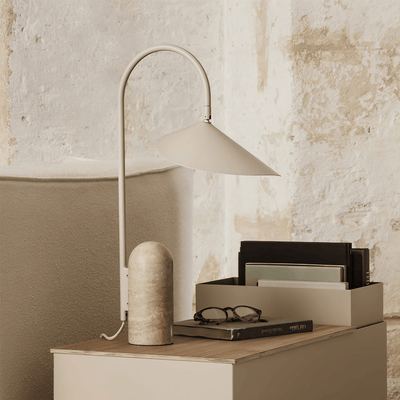
One of the most practical interior design techniques for surface styling is the 3-5-7 rule, a simple framework for creating balanced vignettes on coffee tables, consoles, shelves, and mantels. Rather than arranging items randomly, this guideline suggests using odd numbers of decorative objects grouped in threes, fives, or sevens.
Why odd numbers? Our brains find asymmetrical groupings more visually interesting and organic than even-numbered arrangements, which can feel overly rigid or static. A trio of candle holders at varying heights creates movement, while five books stacked with a small object on top adds purposeful imperfection.
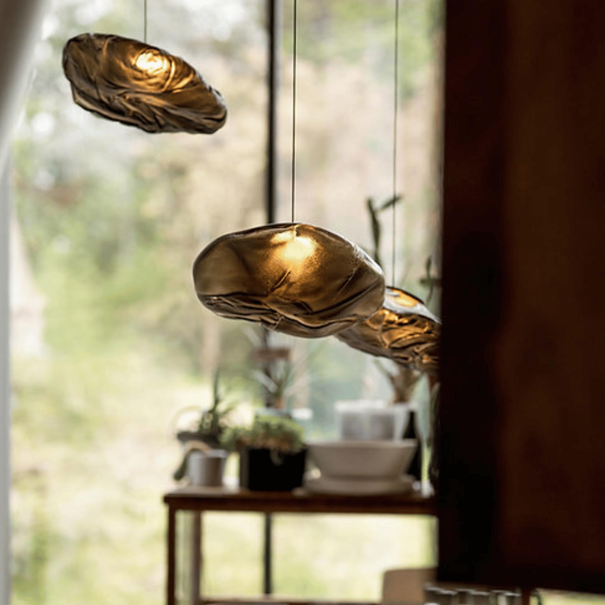
The rule also suggests varying the heights, textures, and scales within your grouping. Mix tall with short, smooth with rough, substantial with delicate. For example, a sculptural object like the Driva Sculptural Cloud Pendant Light demonstrates this principle beautifully—it's a single statement piece that draws the eye while leaving surrounding negative space to breathe.
The 60-30-10 Color Rule for Harmonious Spaces
Creating a cohesive color palette often feels like the most intimidating aspect of decorating. The 60-30-10 rule removes guesswork by assigning clear percentages to your color choices, creating visual harmony without monotony.
Here's how it breaks down: 60% of your room should be your dominant color—typically walls, large furniture, and foundational textiles. 30% goes to your secondary color in medium-sized elements like area rugs, accent chairs, and drapery. The remaining 10% is reserved for accent color—throw pillows, artwork, and decorative accessories that add personality.
Using Color to Create Visual Flow
When selecting your 60-30-10 palette, consider how colors transition between rooms. Scandinavian-inspired spaces often use soft neutrals as the 60% foundation—warm whites, soft grays, or beige tones—allowing natural materials and lighting to provide depth. Your 30% secondary might be a muted sage or pale blue, while the 10% accent introduces warmth through brass, natural wood, or terracotta tones.
Lighting as a Design Fundamental
Among the seven basics of interior design, light arguably has the most transformative power. It doesn't just illuminate—it sculpts, defines, and completely alters how we perceive space. Professional decorators approach lighting in layers: ambient light for overall illumination, task lighting for specific activities, and accent lighting to highlight architectural features or artwork.
The quality of light matters as much as its placement. Warm, dimmable sources create the hygge atmosphere central to Scandinavian living, while cooler light suits task-oriented areas like home offices. Understanding how to layer these sources—and where shadows fall—is essential for rooms that feel alive throughout the day.

Pendant lighting deserves special attention in this layering strategy. A thoughtfully chosen fixture serves dual purposes: functional illumination and sculptural focal point. The interplay between light and form creates that coveted "curated" feeling that defines professionally designed spaces.

Driva Sculptural Cloud Pendant Light in Glass
$199.00 $289.00
Create a stunning focal point with this sculptural cloud glass pendant that softens any room with ethereal ambient light and Nordic craftsmanship.
Explore ProductCreating Focal Points That Draw the Eye
Every well-designed room has a clear focal point—an element that immediately draws attention when you enter the space. In a living room, this might be a fireplace or dramatic piece of art. In bedrooms, it's often the headboard wall. Without intentional focal points, rooms feel unfocused and visually chaotic.
To create an effective focal point, you need contrast. This can mean scale (one oversized piece among smaller furnishings), color (a bold accent against neutrals), or texture (a rough natural material amid smooth surfaces). Lighting plays a crucial role here too—spotlighting architectural features or illuminating artwork guides the eye exactly where you want it to go.
When natural focal points don't exist, you create them. A sculptural pendant light hanging in an unexpected location, a gallery wall in a strategic position, or a statement piece of furniture immediately establishes hierarchy in your space.
Texture and Material Mixing Techniques
Perhaps the most overlooked interior design technique is strategic texture mixing. A room with all smooth surfaces feels cold and one-dimensional, while too much rough texture overwhelms the senses. The goal is intentional contrast—pairing linens with leather, raw wood with polished metal, wool with ceramics.
The Japanese philosophy of wabi-sabi, which celebrates imperfection and natural materials, has heavily influenced Scandinavian design. This approach encourages mixing textures that show their age and origin: hand-thrown ceramics, unbleached linens, weathered wood, and forged iron. These materials bring soul to minimal spaces and prevent clean-lined rooms from feeling sterile.

To layer textures effectively, distribute them throughout the room rather than clustering like materials together. If you have a linen sofa, add a rough wool throw, a smooth ceramic vase, and perhaps iron side tables. This creates visual rhythm and encourages the eye to travel through the space.
Clean Lines in Scandinavian Design
The concept of clean lines in interior design finds perhaps its purest expression in Scandinavian aesthetics. Here, clean doesn't mean cold—it means uncluttered, purposeful, and honest. Every line serves a function, whether it's the subtle curve of an armchair designed for comfort or the straight profile of floating shelves that maximize space.
Creating clean lines involves editing. Remove visual clutter by choosing furniture with simple profiles and storage that conceals rather than displays. Look for pieces with visible joinery that speaks to craftsmanship rather than ornate decoration. The negative space around objects becomes as important as the objects themselves.
This emphasis on clean geometry extends to lighting design. Fixtures with streamlined silhouettes contribute to the overall architectural feel of a room while providing essential illumination without visual noise.
Balancing Form and Function
The most enduring interior design techniques honor the reality of daily living. Beautiful spaces that don't accommodate coffee cups, comfortable seating, or adequate lighting inevitably disappoint. The art lies in finding pieces that satisfy both aesthetic and practical requirements.
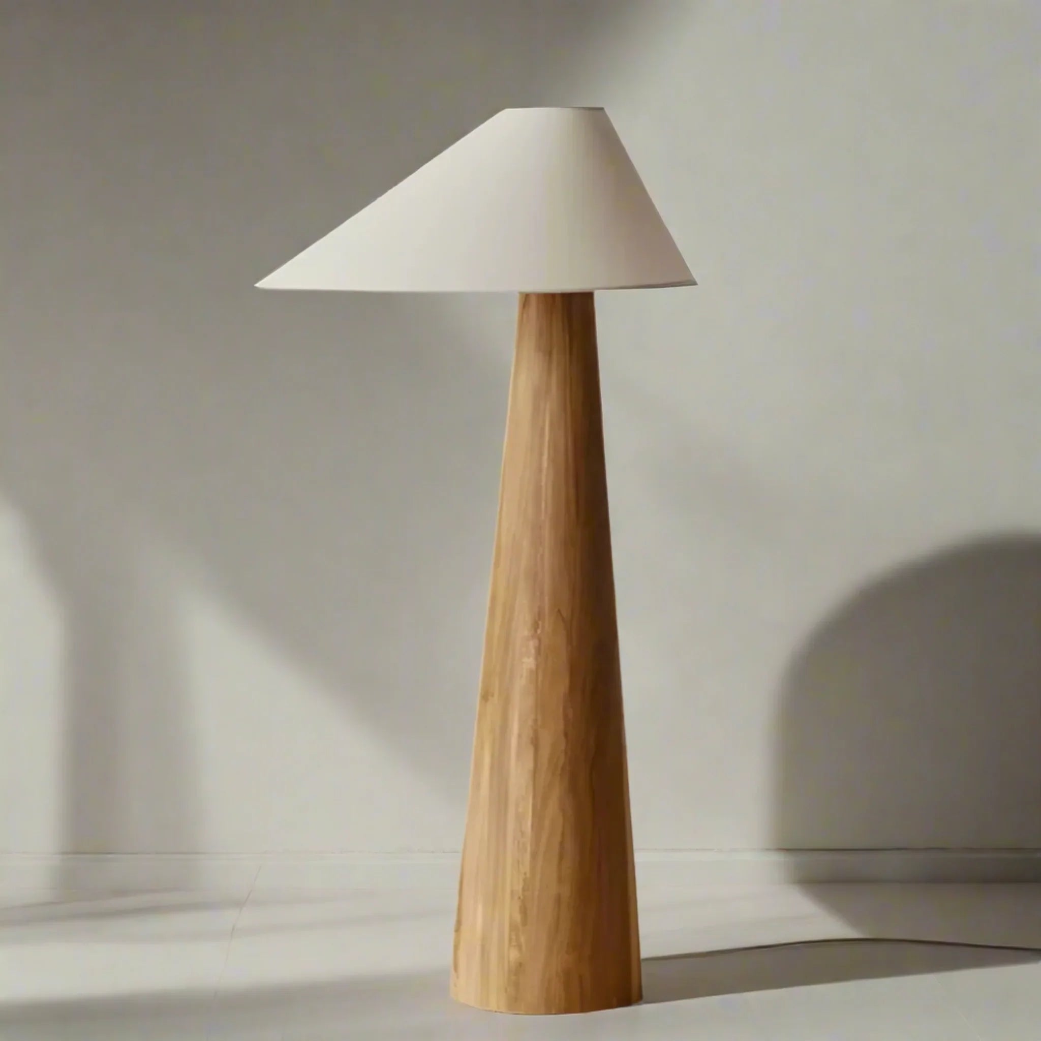
When selecting functional items like lighting, consider how they'll perform throughout different times of day. A floor lamp positioned for reading needs adjustable brightness. Sconces in hallways should provide safe passage while creating atmosphere. For those looking to explore more options for ambient floor lighting, our Floor Lamps collection offers a curated selection of designs that balance sculptural presence with practical illumination.
This principle—choosing objects that work beautifully while working well—is the hallmark of mature design sensibility. It requires patience, careful editing, and willingness to invest in fewer, better pieces.
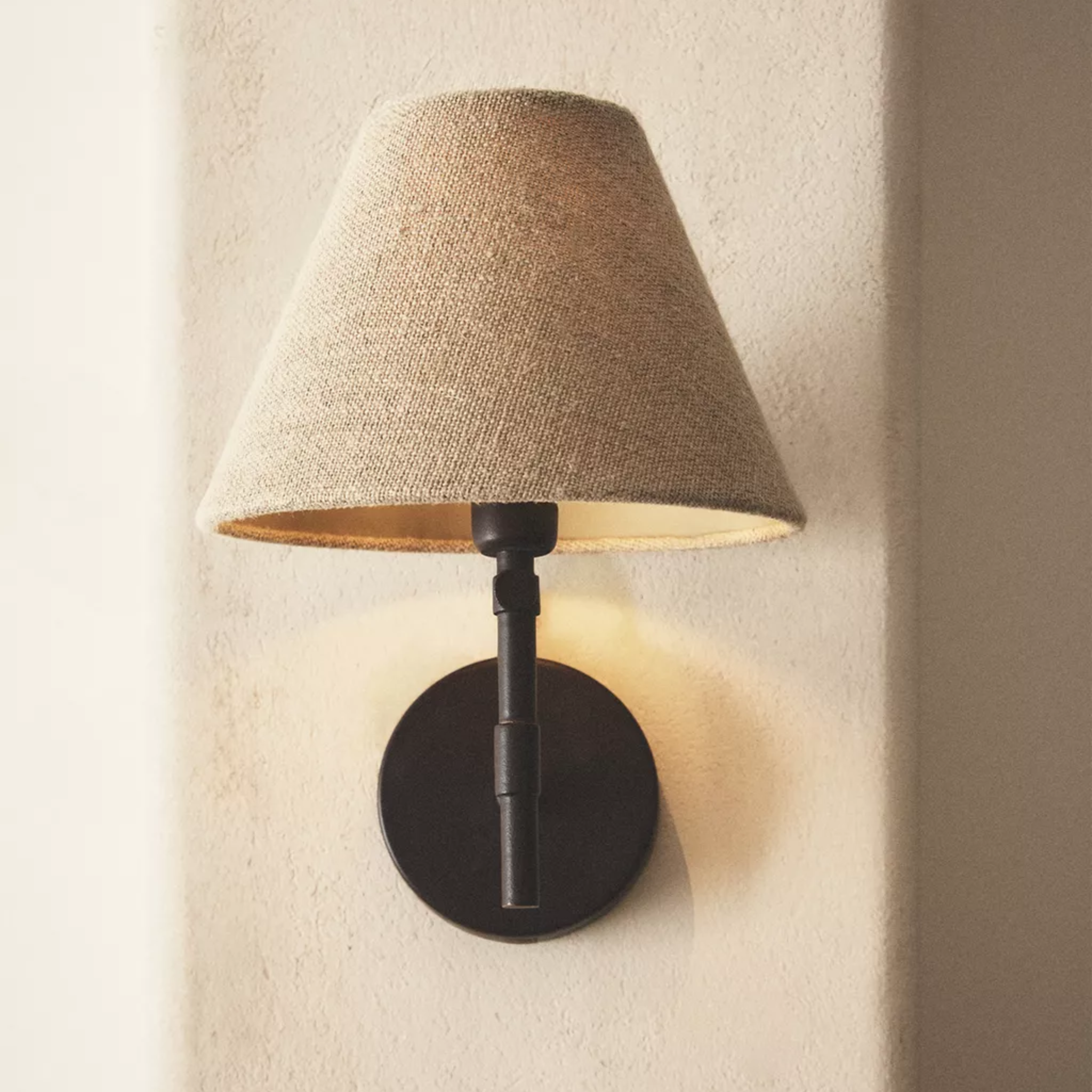
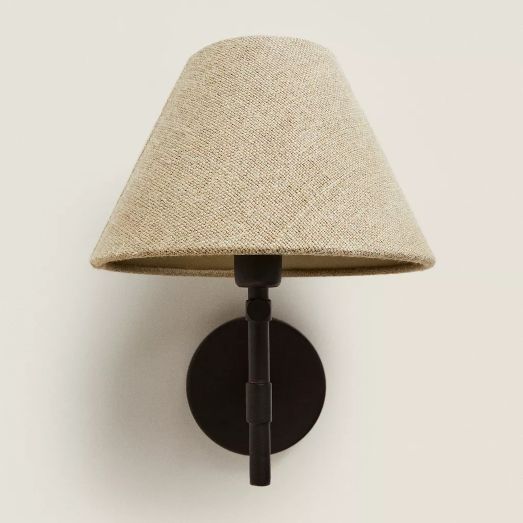
Lighting Essentials for Layered Spaces

Eldorm Handcrafted Wabi-Sabi Iron Wall Sconce
$199.00
$259.00
Layer textured ambient light with this iron and fabric sconce that brings Nordic warmth and wabi-sabi character to bedroom and entryway walls. Learn more ➔

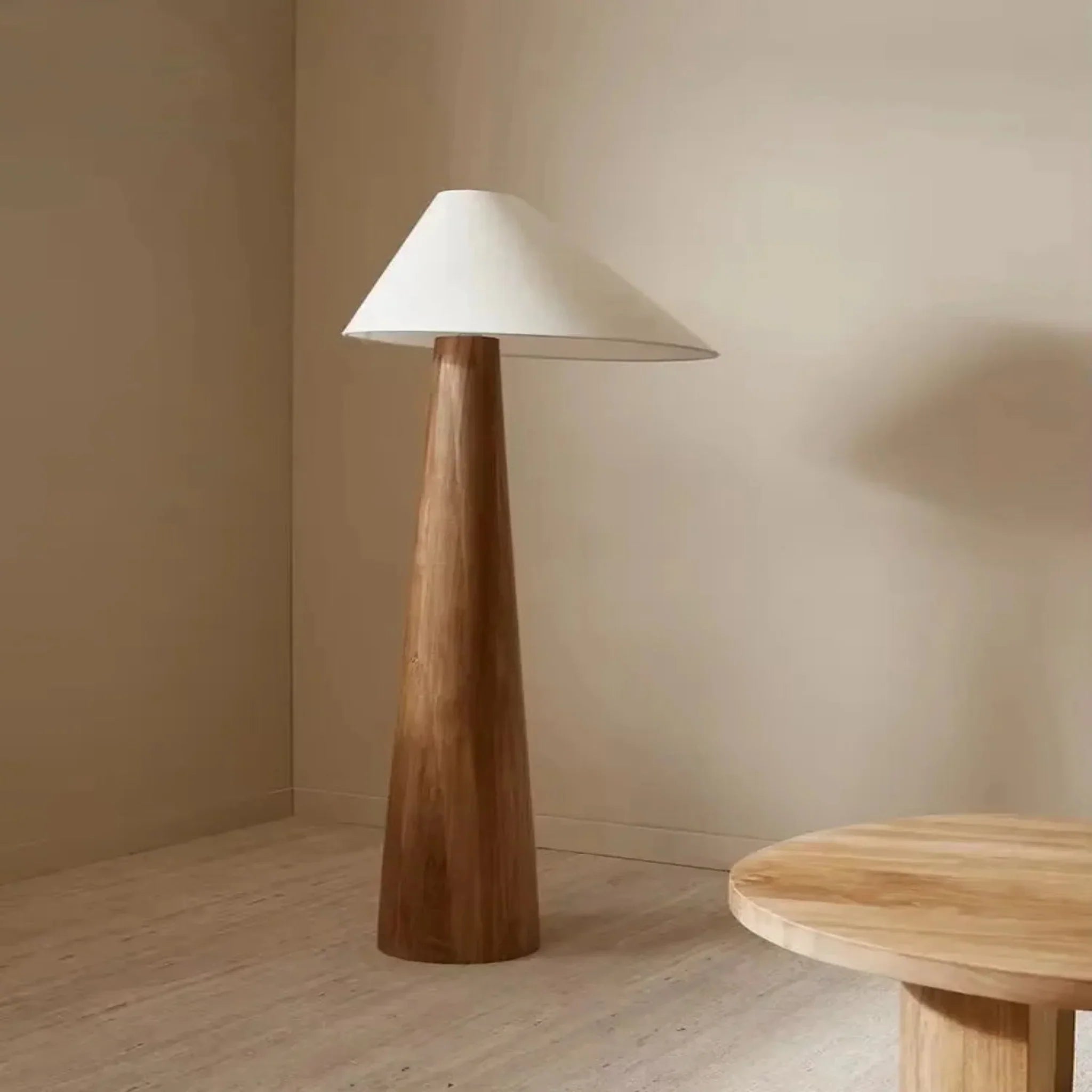
Stille Japanese Wabi-Sabi Solid Wood Floor Lamp
$399.00
$699.00
Anchor your space with zen ambient lighting from this minimalist solid wood floor lamp that celebrates natural materials and Japanese design principles. Learn more ➔
How to Start Decorating Any Room
If you're staring at an empty room or an outdated space you want to refresh, the starting point matters enormously. Jumping directly into buying furniture often leads to mismatched pieces and regret. Instead, follow this intentional process:
- Measure and plan: Create a floor plan noting windows, doors, electrical outlets, and architectural features. Understanding your spatial constraints prevents costly mistakes.
- Establish your focal point: Identify or create the room's natural center of attention. Everything else should support, not compete with, this anchor.
- Choose your color palette: Apply the 60-30-10 rule to create cohesion. Start with neutrals for the 60% foundation, then layer in your secondary and accent colors.
- Address lighting first: Before buying a single piece of furniture, plan your lighting layers. Consider where you need task light, where ambient light should fill, and where you want accent illumination.
- Select anchor pieces: Invest in larger items—the sofa, dining table, or bed—that you'll keep for years. These should feel substantial and timeless.
This methodical approach prevents the overwhelm that paralyzes many decorating projects. It also ensures that when you do make purchases, they serve your overall vision rather than creating clutter.
Putting It All Together: Design With Confidence
Interior design techniques aren't about rigid rules—they're about frameworks that create harmony amid infinite possibilities. The 3-5-7 rule gives you permission to style surfaces with odd-numbered intentionality. The 60-30-10 color formula removes the paralysis of palette selection. Understanding the seven basic elements provides a lens through which to evaluate every choice.
As you apply these principles, remember that your home should reflect how you actually live, not just how you wish to appear. Scandinavian design's emphasis on hygge—that quality of coziness and contentment—reminds us that truly beautiful spaces are those that welcome us home at the end of the day.
At Skonne, we believe the right lighting and decor can transform these techniques from abstract concepts into lived experience. Whether you're anchoring your living room with the sculptural presence of the Driva Pendant, layering ambient warmth with the Eldorm Sconce, or bringing zen intentionality with the Stille Floor Lamp, thoughtful pieces elevate the fundamentals into something extraordinary.
Start with one room, one rule, one beautiful piece. The confidence will follow.
Frequently Asked Questions about Interior Design Techniques
The 3-5-7 rule is a styling technique for surface arrangements that suggests grouping decorative objects in odd numbers—three, five, or seven items. Odd-numbered groupings create visual interest and feel more organic than even-numbered arrangements. The rule also encourages varying heights, textures, and scales within your groupings for maximum impact.
The seven basics of interior design are: Space (the physical boundaries and areas within a room), Line (visual paths created by furniture and architecture), Form (three-dimensional shapes of objects), Light (natural and artificial illumination), Color (the palette that creates atmosphere), Texture (tactile surface qualities), and Pattern (repeating visual elements). Understanding how these elements interact creates balanced, harmonious spaces.
Nicola Harding is a British interior designer known for what she calls "studied casualness"—spaces that feel refined yet lived-in. Her style blends English country house tradition with contemporary comforts, featuring rich colors, layered patterns, vintage pieces, and an emphasis on creating rooms for real living. Harding's approach prioritizes comfort and personal expression over strict adherence to design rules.
The top five interior design styles are: Scandinavian (minimalist, light-filled spaces with natural materials and clean lines), Modern (sleek furnishings, neutral colors, and emphasis on "form follows function"), Traditional (classic furniture, rich colors, symmetrical arrangements, and formal elegance), Contemporary (constantly evolving, currently favoring curved lines, mixed materials, and bold art), and Japandi (a fusion of Japanese and Scandinavian aesthetics emphasizing wabi-sabi principles and functional minimalism).
Start decorating by following these steps: First, measure your space and create a floor plan. Second, establish or identify the room's focal point. Third, choose your color palette using the 60-30-10 rule. Fourth, plan your lighting layers—ambient, task, and accent. Finally, select anchor furniture pieces before adding accessories. This methodical approach prevents overwhelm and ensures cohesive results.