Standing in front of a wall of paint swatches can feel overwhelming. That sea of beige, gray, and unexpected pops of color leaves many homeowners wondering: Where do I even begin? The truth is, home decor color schemes are more than just aesthetic choices—they shape how a room feels, how spacious it appears, and even how you feel when you walk through the door.
Whether you are refreshing a single room or reimagining your entire home, the right color combinations for home decor can transform ordinary spaces into intentional sanctuaries. At Skonne, we believe that Scandinavian design principles offer the perfect framework for approaching color with confidence—focusing on warmth, simplicity, and the subtle interplay of tones that create harmony without sacrificing personality. In this guide, you will discover how to select palettes that reflect your style while learning how the right lighting and accessories bring those colors to life.
Understanding the Language of Color
Before diving into specific palettes, it helps to understand the foundational vocabulary designers use. Color schemes follow established patterns that create visual cohesion, and recognizing these patterns makes selecting your palette significantly less intimidating.

The Seven Major Color Schemes
Interior designers reference seven primary color relationships when developing palettes for residential spaces:
- Monochromatic: Variations of a single hue, from deep to light, creating serene, sophisticated spaces
- Complementary: Colors opposite each other on the color wheel (think blue and orange), offering bold contrast and energy
- Analogous: Three colors positioned next to each other on the wheel, such as sage green, forest green, and teal, producing harmonious, natural transitions
- Triadic: Three colors equally spaced on the wheel, creating vibrant, balanced interiors
- Split-Complementary: A base color paired with the two colors adjacent to its complement, offering contrast with less tension than true complementary schemes
- Tetradic (Double Split-Complementary): Four colors forming a rectangle on the wheel, ideal for complex, layered spaces
- Square: Four colors equally spaced on the wheel, creating rich, balanced environments with visual interest throughout
Understanding these relationships helps you move beyond random color selection toward intentional interior color combinations that feel both curated and personal.
What Color Trends Are Shaping 2026 Interiors
The era of cool gray dominance is quietly giving way to something warmer. As we move toward 2026, warm neutral color schemes are replacing the stark grays that defined the past decade. Think creamy oatmeal, mushroom taupe, warm ivory, and sun-bleached linen—these tones create spaces that feel welcoming rather than clinical.
Alongside this shift, earth tone home decor has experienced a significant resurgence. Terracotta, clay, ochre, and sand are no longer relegated to southwestern or bohemian aesthetics. Instead, they are being reimagined through a Scandinavian lens—paired with clean lines, natural materials, and thoughtful lighting that highlights their organic warmth.
Key Trend Insight: The move toward warm neutrals does not mean abandoning color entirely. Rather, it represents a desire for spaces that feel grounded, human, and connected to the natural world.
The 60-30-10 Rule: Your Color Distribution Framework
Even the most beautiful color combinations for home decor can feel chaotic without proper balance. The 60-30-10 rule provides a simple mathematical approach to color distribution:
- 60% of the room should feature your dominant color (typically walls and large furniture)
- 30% should showcase your secondary color (upholstery, textiles, smaller furniture)
- 10% should be your accent color (accessories, artwork, lighting fixtures)
This framework prevents any single hue from overwhelming the space while ensuring your accent colors—often the most vibrant or interesting elements—receive the visual attention they deserve. Lighting plays a crucial role here, as the quality and color temperature of illumination can shift how these percentages actually read in a space.


Scandinavian Color Palettes: Warmth Through Restraint
The Scandinavian color palette has evolved significantly from the stark white interiors often associated with Nordic design. Contemporary Scandinavian spaces embrace what designers call warm minimalism—a balance of clean lines with inviting, earthy tones.
A classic modern Scandinavian palette might include:
- Soft white or warm cream as the dominant backdrop (60%)
- Light oak, birch, or pale gray as the secondary tone (30%)
- Dusty sage, muted terracotta, or oceanic blue as the accent (10%)
The key to Scandinavian color success lies in the undertones. Rather than pure stark whites, opt for whites with subtle yellow, pink, or gray undertones that create warmth without sacrificing brightness. Natural wood elements bridge these tones, adding texture and organic warmth that prevents the space from feeling sterile.
Sage Green Home Decor in Scandinavian Spaces
Sage green home decor has become a defining element of contemporary Scandinavian interiors. This muted, gray-green tone bridges the gap between neutral and color, offering versatility that few other hues can match. In Scandinavian contexts, sage works beautifully with natural wood, cream textiles, and black metal accents.
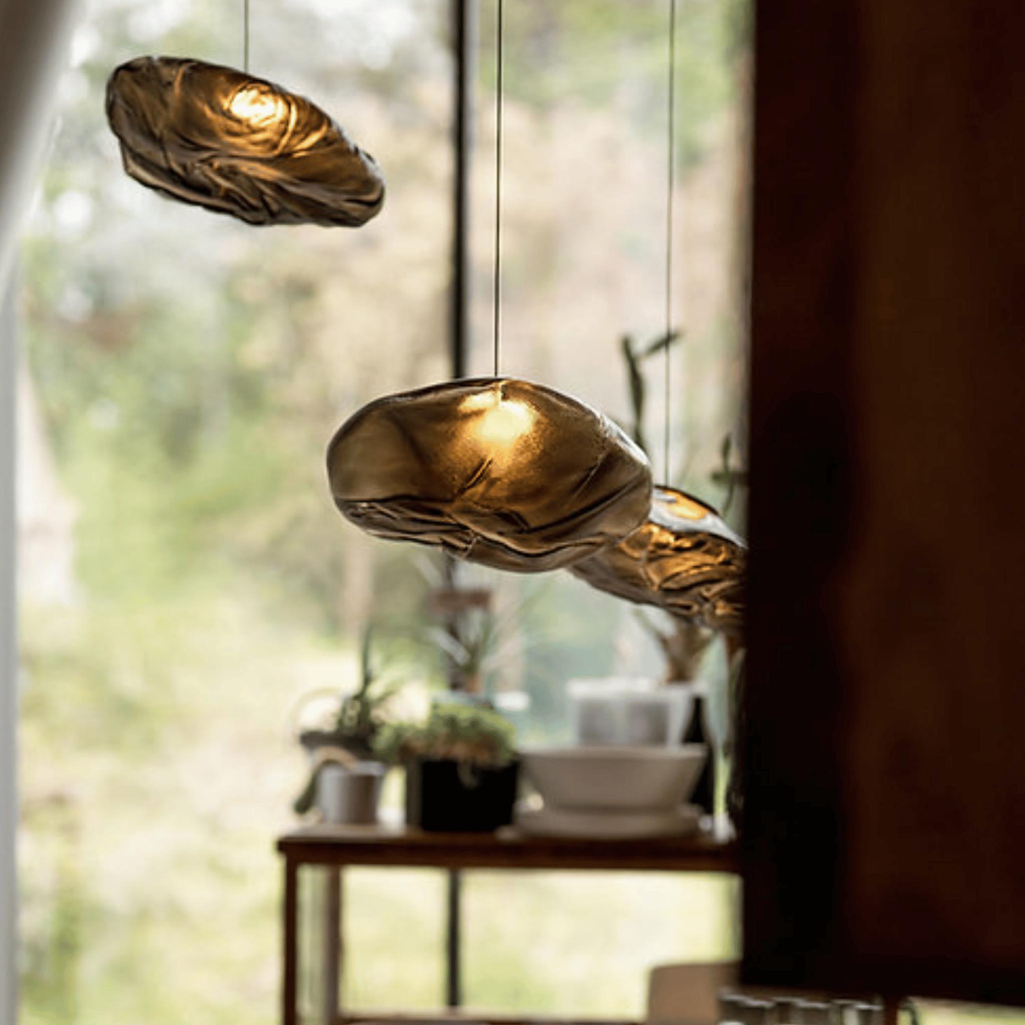
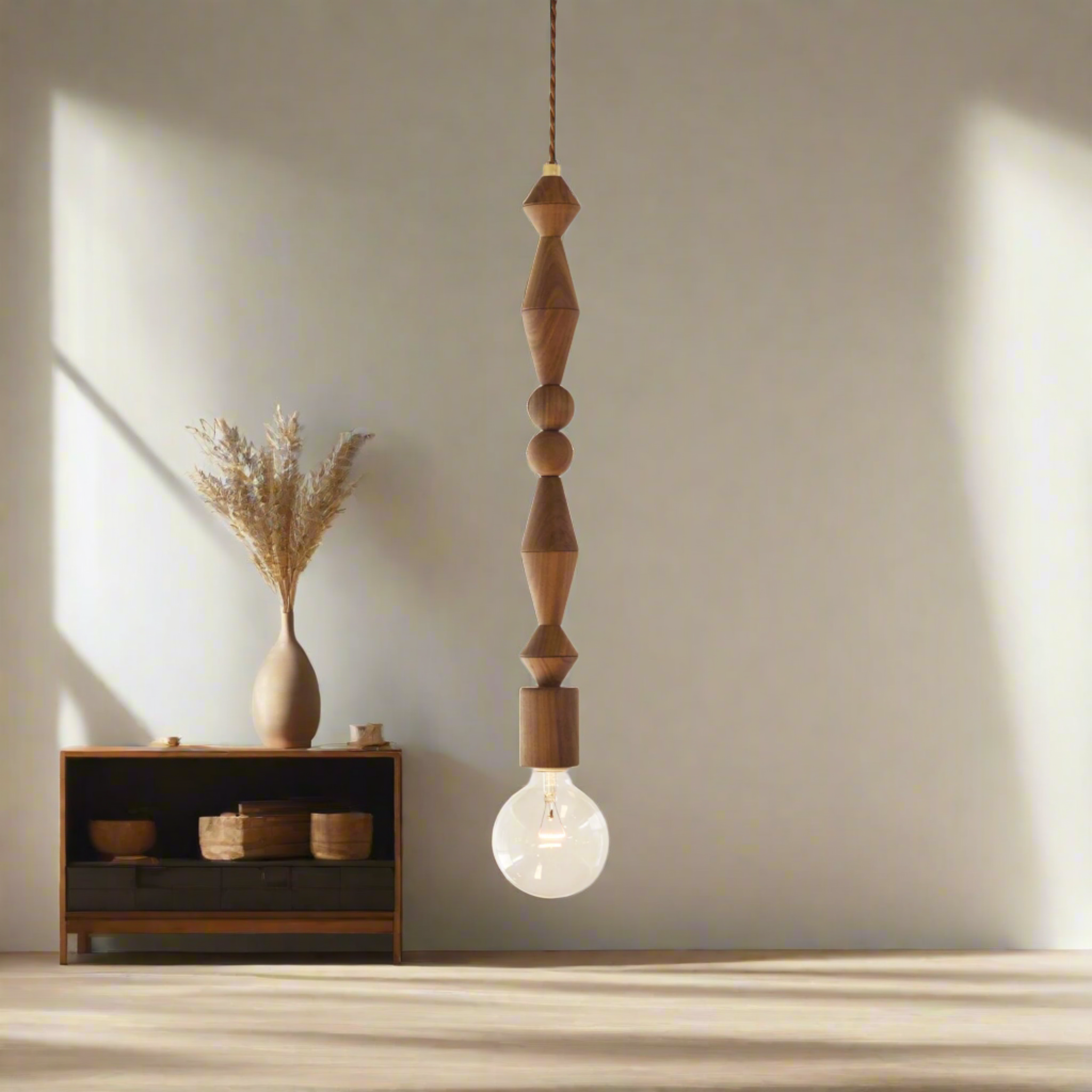
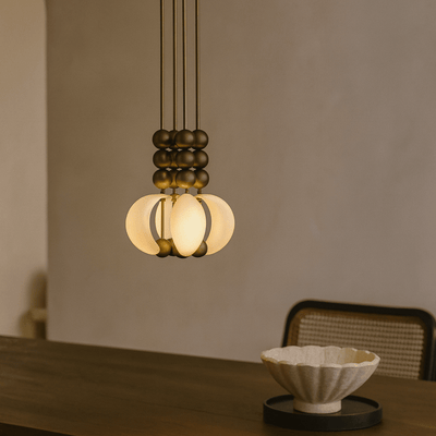
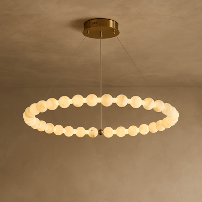
When incorporating sage, consider how lighting affects its appearance. Cool LED lighting can shift sage toward gray, while warm incandescent or LED bulbs enhance its subtle green warmth. The Driva Sculptural Cloud Pendant Light in Glass offers an ideal lighting solution for sage-green spaces, with three glass finish options allowing you to either complement or contrast your palette intentionally.

Driva Sculptural Cloud Pendant Light in Glass
$199.00 $289.00
Choose from smoky gray, crystal clear, or warm amber glass finishes to perfectly complement your chosen color scheme and interior palette.
Explore ProductEarth Tone and Terracotta Palettes
Terracotta home decor has transcended its bohemian associations to become a sophisticated choice for contemporary interiors. When paired with warm neutrals, natural materials, and thoughtful lighting, terracotta creates spaces that feel both grounded and elevated.
An earth-tone palette for modern homes typically features:
- Warm white or cream walls as the foundation
- Rich terracotta, burnt sienna, or rust as secondary elements through upholstery or textiles
- Olive green, ochre, or deep umber as complementary accents
The success of earth tone palettes depends heavily on material quality. Natural wood, aged brass, linen, and wool textiles amplify the organic warmth of these colors. For those looking to explore more options, our Home Decor collection offers a curated selection of accessories designed to complement earth-toned interiors.
How to Choose Your Home Color Palette: A Practical Approach
Theory provides the foundation, but application brings color schemes to life. When selecting modern home color schemes, begin with a source of inspiration—a photograph, textile, or natural element that captures the feeling you want to achieve.
Follow these steps to develop a cohesive palette:
- Identify your dominant mood: Do you want energizing or calming? This determines whether you lean toward warm or cool tones
- Test undertones in your actual space: Natural light varies dramatically by room orientation—south-facing rooms amplify warm tones, while north-facing spaces may need warmer colors to counteract cool light
- Consider existing elements: Flooring, cabinetry, and architectural features that cannot change should anchor your palette decisions
- Create visual hierarchy: Use the 60-30-10 rule to ensure balance and flow between rooms

Lighting as a Color Strategy
Lighting fixtures serve dual roles in color-driven interiors: they provide necessary illumination while acting as sculptural elements within your palette. The materials and finishes of your lighting can either blend seamlessly into your scheme or provide deliberate contrast that adds visual interest.
For earth tone home decor and warm neutral schemes, lighting with natural wood and brass elements creates cohesion. The warmth of walnut paired with polished brass echoes the rich tones of terracotta and ochre while adding sophisticated contrast. Similarly, fixtures with dark wood finishes can ground lighter Scandinavian palettes, creating depth without darkness.
Lighting That Completes Your Color Story

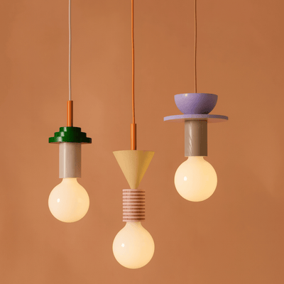
Gloda Walnut Brass French Style Pendant Light
$169.00
$229.00
Rich walnut wood and polished brass accents bring warm earth tones to your space, ideal for grounding neutral and terracotta color schemes. Learn more ➔

Vedra Wood and Glass Pendant Light Nordic Style
$299.00
$509.00
Available in dark or light wood finishes, this handcrafted pendant adds natural warmth that bridges Scandinavian minimalism with organic color palettes. Learn more ➔
When selecting lighting for a coastal blue home decor scheme, consider how metal finishes interact with blue tones. Brass and gold warm up cooler blues, while matte black creates sophisticated contrast. The Vedra Wood and Glass Pendant Light Nordic Style bridges Scandinavian minimalism with organic warmth through its handcrafted wood construction, available in dark or light finishes to match your specific palette vision.
Color temperature matters as much as fixture design. Warmer bulbs (2700K-3000K) enhance earth tones and warm neutrals, while cooler temperatures (4000K+) can make warm palettes appear washed out. Many modern LED options now offer adjustable color temperatures, allowing you to shift ambiance from energizing daylight mimics to cozy evening warmth.
Bringing Your Palette to Life
The final step in implementing home decor color schemes involves layering textures and materials that amplify your chosen palette. A room painted in warm cream immediately becomes more interesting when layered with linen curtains, a wool throw, ceramic vases, and the right lighting fixtures that catch and reflect your colors throughout the day.
Remember that successful interiors evolve. Your initial color scheme provides the foundation, but the most lived-in, inviting spaces develop personality through collected objects, seasonal textiles, and lighting that adapts to daily rhythms. The goal is not perfection but intentionality—every element should feel chosen rather than random.

Pro Tip: Live with your color choices before committing fully. Paint large swatches on multiple walls, observe them at different times of day, and ensure they complement both natural and artificial lighting conditions.
Creating Cohesion Throughout Your Home
While individual rooms can express different moods, good color combos for houses typically maintain some thread of continuity. This does not mean every room must share identical palettes, but rather that colors should relate to one another as you move through spaces.
One effective strategy involves selecting a connector color—a neutral or subtle tone that appears in every room, whether through trim, lighting fixtures, or textiles. This creates subconscious continuity while allowing each space its own personality. White oak flooring, matte black hardware, or brass lighting fixtures can serve this unifying role beautifully.
For authoritative guidance on color psychology and its impact on residential well-being, the color psychology research compiled by interior design experts offers valuable insights into how different hues affect mood and perception. Additionally, the color theory resources from professional paint manufacturers provide technical depth on undertones and compatibility.
Conclusion: Color Confidence Through Intentional Design
The journey from paint swatch overwhelm to color confidence requires understanding the principles behind successful palettes and trusting your instincts about what feels right for your space. Whether you gravitate toward the clean restraint of a Scandinavian color palette, the grounded warmth of earth tone home decor, or the refreshing energy of coastal blue home decor, the key lies in intentional selection and thoughtful implementation.
At Skonne, we understand that lighting serves as the final brushstroke on your color canvas—the element that brings warmth, depth, and dimension to every carefully chosen hue. Our curated collection of Scandinavian-inspired lighting is designed to complement the palettes that create homes worth living in, from pendants that cast the perfect glow on sage green walls to fixtures that amplify the richness of terracotta accents. When your color scheme meets the right lighting, your space transforms from decorated to truly lived-in.
Frequently Asked Questions about Home Decor Color Schemes
The seven major color schemes used in interior design are: monochromatic (variations of one hue), complementary (colors opposite on the color wheel), analogous (adjacent colors on the wheel), triadic (three equally spaced colors), split-complementary (a base color plus two adjacent to its complement), tetradic (four colors forming a rectangle on the wheel), and square (four equally spaced colors). Each creates different visual effects, from serene and cohesive to bold and energetic.
Warm neutrals are replacing cool gray as the dominant neutral for 2026. Think creamy oatmeal, mushroom taupe, warm ivory, sun-bleached linen, and beige with subtle undertones of pink or yellow. These warmer alternatives create more welcoming, grounded spaces that feel connected to natural materials and organic design principles.
Good color combinations for houses balance cohesion with variety. Popular pairings include warm white with sage green and natural wood, cream with terracotta and burnt sienna accents, soft gray with navy blue and brass metallics, and beige with olive green and black accents. The 60-30-10 rule helps maintain balance: 60% dominant color, 30% secondary, 10% accent.
The 70-20-10 rule is a variation of the classic 60-30-10 color distribution principle. It suggests allocating 70% of a room to a dominant color (walls and large furniture), 20% to a secondary color (smaller furniture and textiles), and 10% to accent colors (accessories, artwork, and lighting). Some designers use 70-20-10 to allow more flexibility than the stricter 60-30-10 ratio, though both achieve similar balance.
Start by identifying the mood you want to create, then find inspiration in existing elements you cannot change (flooring, architectural features). Test paint swatches in your actual space at different times of day, as lighting dramatically affects color appearance. Consider your home's orientation—south-facing rooms can handle cooler tones, while north-facing spaces benefit from warmth. Finally, use the 60-30-10 rule to ensure balanced distribution, and maintain subtle continuity between rooms through connector colors or recurring materials.