Walking into a room awash with warm colors feels like stepping into an embrace. Unlike the cool detachment of stark grays and clinical whites, warm colors in interior design invite you to linger, creating spaces that feel both sophisticated and deeply personal. Whether you're drawn to the rich depth of cognac leather, the earthy glow of terracotta, or the soft comfort of caramel tones, understanding how to work with these hues can transform your home from merely decorated to genuinely soulful.
But achieving that perfect balance—where warmth feels curated rather than chaotic—requires more than just picking a paint color. It's about understanding color theory, mastering the interplay of light and texture, and selecting pieces that anchor your vision. In this room-by-room guide, you'll discover how to layer rich, inviting tones that align with Scandinavian warmth while maintaining that elevated, intentional aesthetic that makes a space feel truly expensive.
What Are Warm Colors for Interior Design?
At their core, warm colors are those that remind us of sunlight, fire, and earth. Think beyond basic reds and oranges to encompass the full spectrum of earthy color palettes—from deep burgundies and burnt siennas to warm neutrals like camel, sand, and greige. These hues draw from the red-yellow side of the color wheel, possessing an inherent ability to advance visually and make spaces feel cozier and more intimate.
The current shift in design trends reflects our collective desire for comfort. After years of cool grays dominating interiors, 2026 is witnessing a decisive move toward warmer alternatives. Rich earth tones like cognac, caramel, clay, and warm taupe are replacing the once-ubiquitous gray, bringing with them a sense of groundedness and organic beauty that resonates with contemporary homeowners seeking authenticity.

The Psychology Behind Warm Interiors
Color isn't merely decorative—it shapes how we feel within a space. Warm tones activate psychological responses associated with comfort, energy, and social connection. They stimulate conversation in living areas, promote relaxation in bedrooms, and create appetite in dining spaces. This emotional resonance makes them particularly powerful when you're looking to create that coveted "expensive" aesthetic that feels both approachable and refined.
The Scandinavian design philosophy, which Skonne embodies, has long understood this balance. Far from the stark white minimalism many associate with Nordic style, true Scandinavian warmth embraces honeyed wood tones, soft amber glass, and textiles in ochre and rust. This warm minimalist interior design approach proves that cozy and curated can coexist beautifully.
Mastering the Mix: Warm and Cool Color Theory
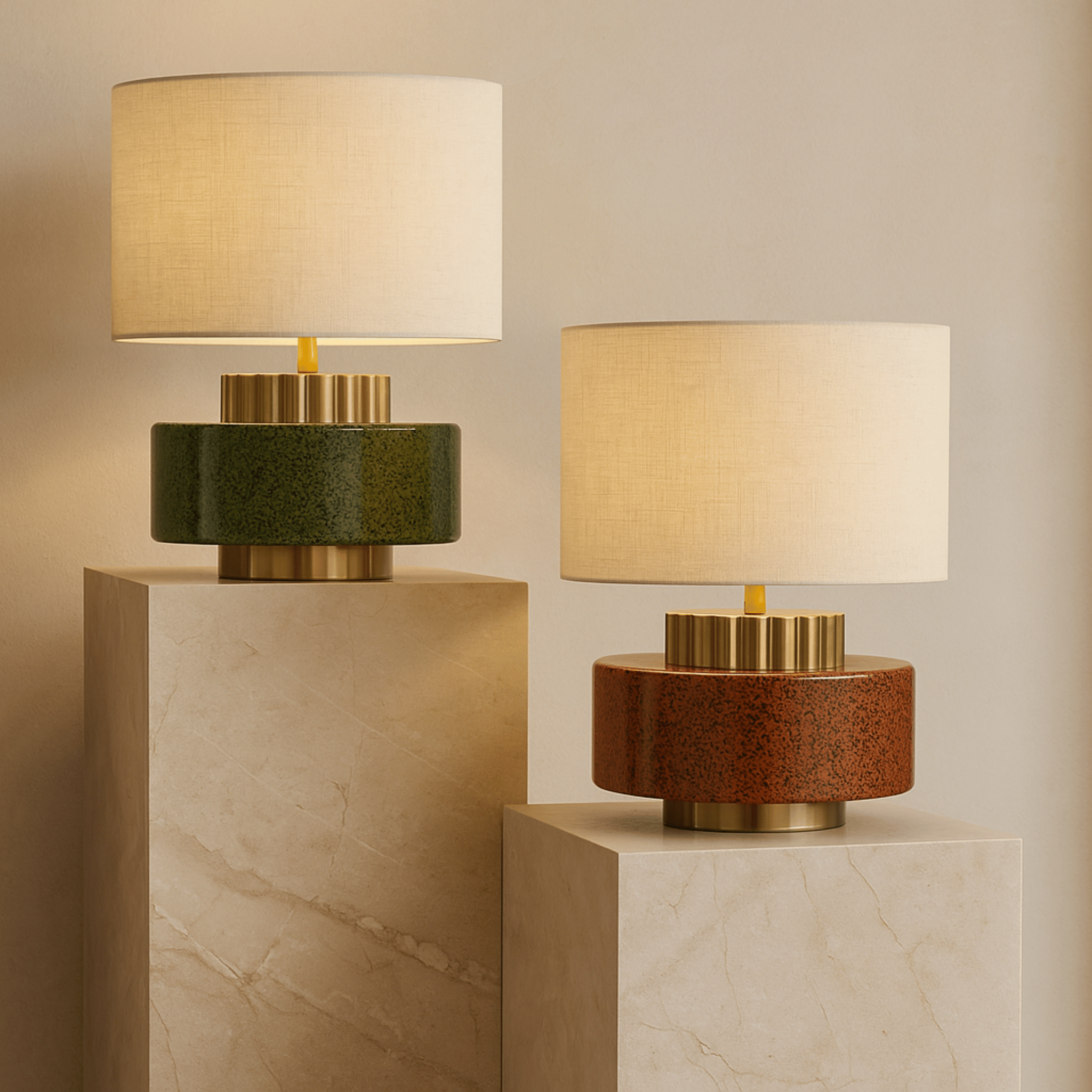
Successfully incorporating warm colors doesn't mean banishing cool tones entirely. In fact, the most sophisticated spaces often blend both. The secret lies in choosing one temperature to dominate while using the other as an accent. When you mix warm and cool colors in a living room, for instance, let warm earth tones serve as your foundation—perhaps a cognac leather sofa or terracotta-toned walls—while introducing cooler touches through Glass Pendant Lights or blue-gray ceramics.
This tension creates visual interest and prevents spaces from feeling one-dimensional. The key is ensuring your cool elements have enough depth or warmth in their undertones to harmonize with the overall palette. A slate gray with warm undertones works infinitely better than a stark, cold gray against honeyed woods and amber accessories.

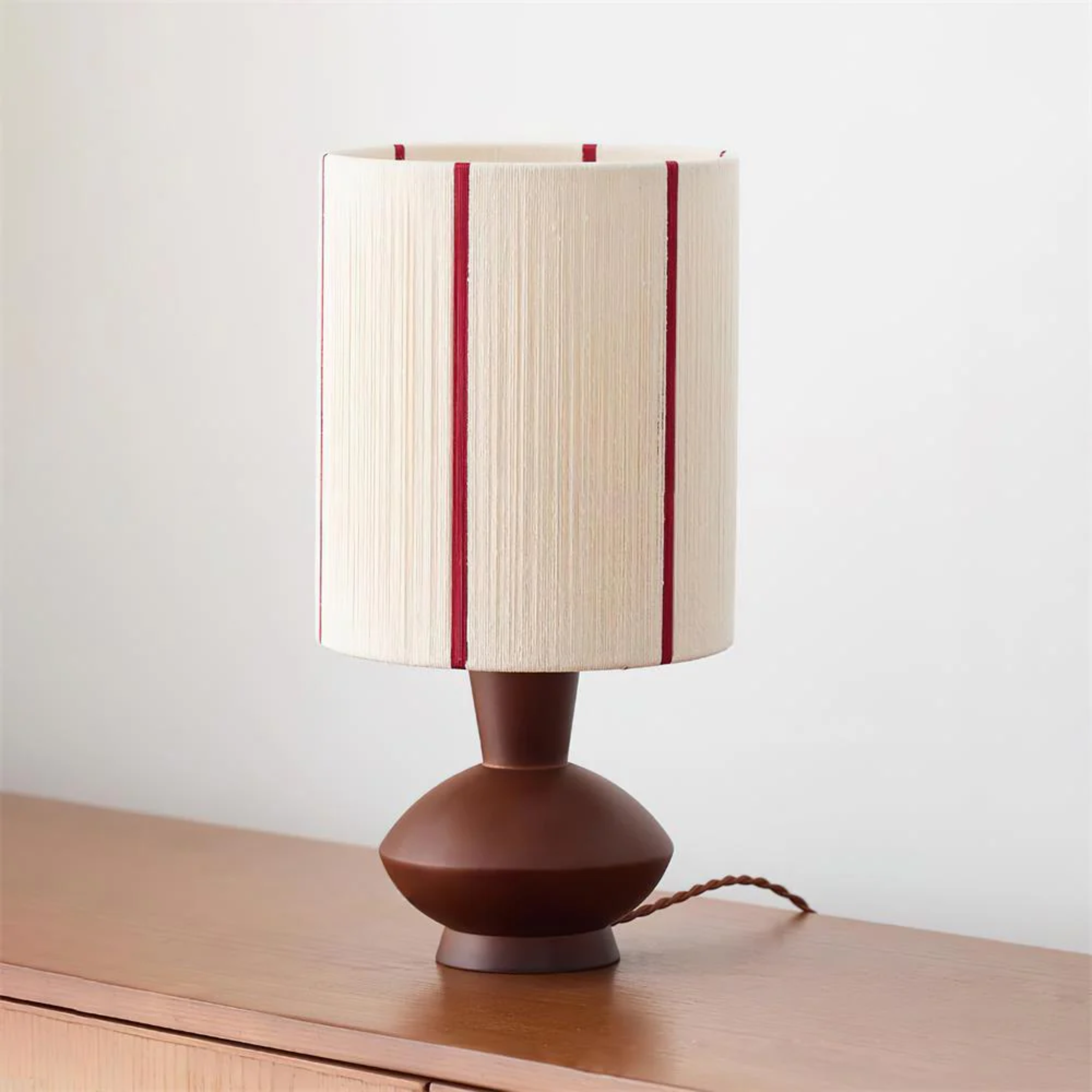
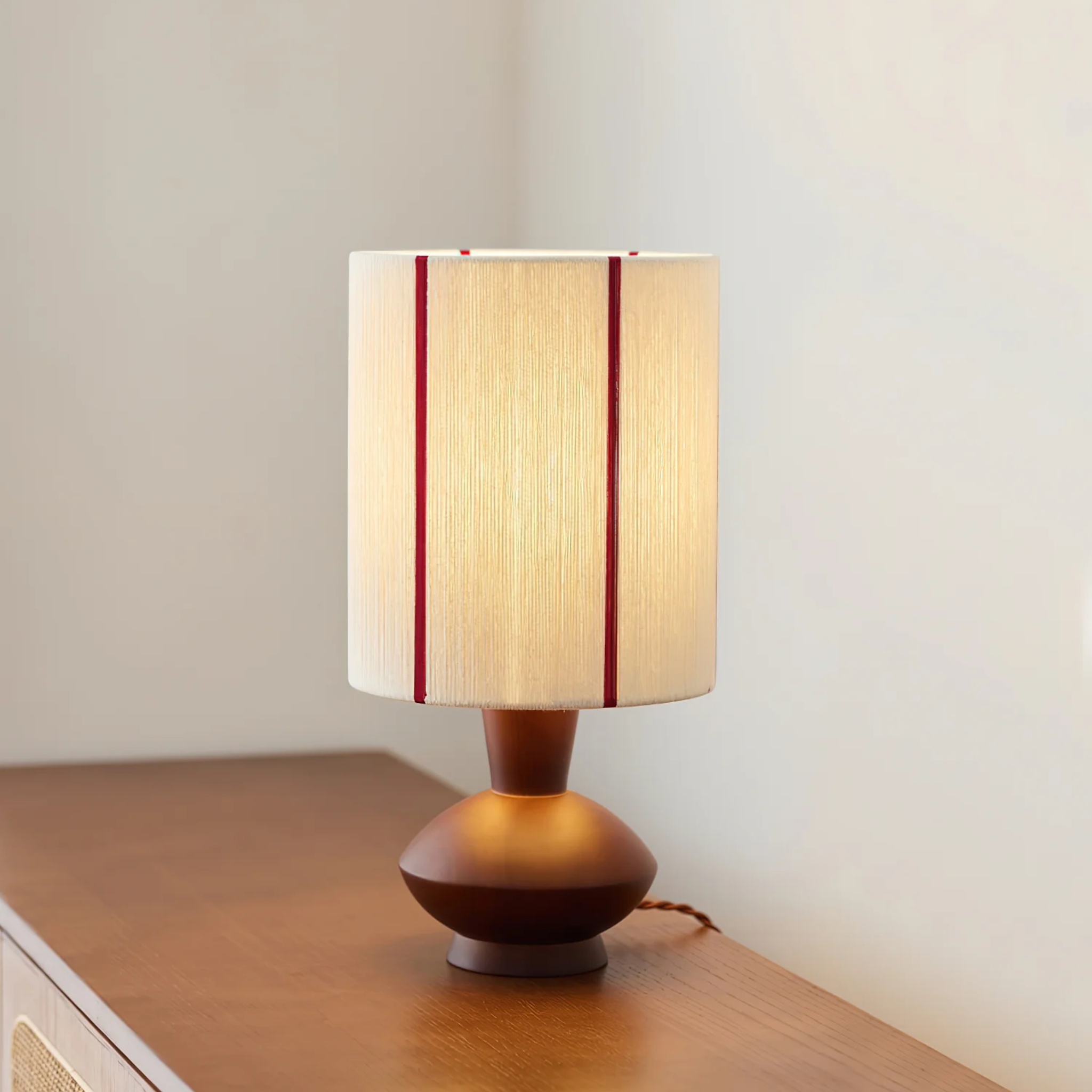
Leireld Artisan Ceramic Pottery Table Lamp Vintage
$469.00 $679.00
Add artisan warmth to your space with this handmade ceramic lamp in rich earthy red, perfect for anchoring warm color palettes with organic texture.
Explore ProductThe Critical Role of Lighting in Warm Palettes
Here's a truth many overlook: color doesn't exist without light, and warm paint colors for living room walls will shift dramatically depending on your lighting scheme. Natural daylight brings out the truest tones, while artificial lighting can either enhance or distort your carefully chosen palette. This is where intentional lighting design becomes essential rather than optional.
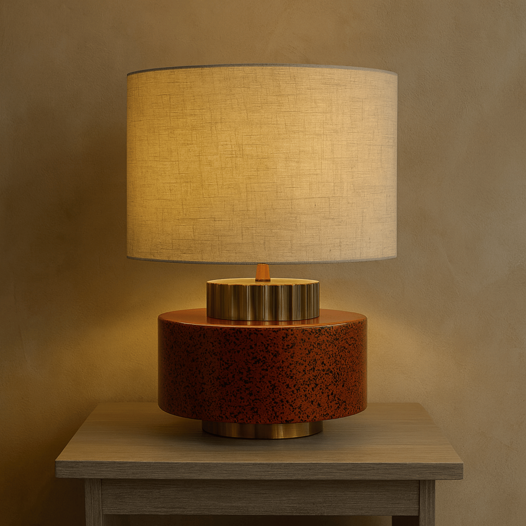
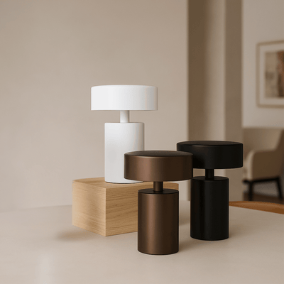
Warmer color temperatures in your light bulbs (2700K-3000K) enhance those rich earthy tones you've selected, while cooler temperatures (4000K+) can make them appear muddy or washed out. Consider layering your lighting—ambient, task, and accent—to create depth and highlight the textural variations that make warm color schemes so visually compelling.


Scandinavian Warm Minimalism: A Curated Approach
The misconception that Scandinavian design must be cold and austere is finally fading. True Nordic style embraces warm neutrals interior design principles, layering natural materials and soft textiles to create spaces that breathe while still feeling embraced. This approach prioritizes quality over quantity, choosing fewer pieces that carry more visual weight through their materiality and color presence.
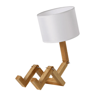
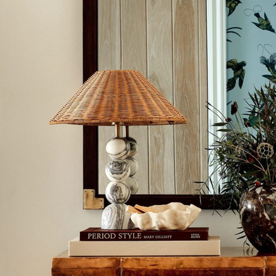
Wood tones play a starring role here, from pale oak to deeper walnut. These natural materials bring inherent warmth that complements rather than competes with your color palette. When selecting furniture and decor, look for pieces that combine organic textures with refined silhouettes—think hand-thrown ceramics, woven natural fibers, and lighting fixtures that cast a soft amber glow.

Room-by-Room Warm Color Strategies
Creating an Inviting Living Room
The living room often serves as the heart of the home, making it the perfect testing ground for bold warm color choices. Start with your largest surfaces—flooring and walls—establishing a foundation of warm neutrals like sand, stone, or soft terracotta. Layer in richer tones through your primary furniture pieces; a cognac leather sofa or rust-colored sectional anchors the space with immediate sophistication.
Texture becomes crucial here. Flat, single-note color applications can feel dull regardless of how warm the hue. Instead, combine matte plaster walls with nubby linen textiles, polished wood side tables, and ceramic accessories in varying earth tones. The resulting depth creates visual intrigue that reads as luxury.
Lighting Solutions for Warm Interior Schemes

Gloda Walnut Brass French Style Pendant Light
$169.00
$229.00
This walnut and brass pendant casts a soft amber glow that beautifully complements warm interior tones while adding vintage sophistication. Learn more ➔

Vedra Solid Wood Vintage Table Lamp with Rope
$299.00
$509.00
Natural wood grain and hemp rope accents bring layered, rustic warmth to any corner, enhancing cozy warm color schemes. Learn more ➔
Warmth in the Bedroom Sanctuary
Bedrooms benefit enormously from warm color psychology, promoting the rest and relaxation we crave in these private spaces. However, the approach here calls for softer applications—think dusty roses, warm taupes, and muted terracottas rather than bold oranges or reds. These gentler tones soothe rather than stimulate, creating a cocoon-like environment conducive to sleep.
Consider painting your ceiling a warm white with creamy undertones rather than stark white, or introduce a warm accent wall behind your headboard. Bedding in natural linen, cotton, or wool in oatmeal, camel, or soft rust completes the look. The Scandinavian approach to bedroom warmth emphasizes natural materials and soft, diffused lighting that mimics the gentle glow of sunset.
Dining Spaces That Gather
Dining rooms offer a unique opportunity to embrace deeper, richer warm tones. These spaces, designed for gathering and lingering over meals, can handle more saturated colors than areas meant for rest. Consider walls in warm ochre, deep mustard, or even a sophisticated rust tone. These colors stimulate appetite and conversation, creating an inherently social atmosphere.
When selecting dining furniture, wood tones ranging from medium oak to rich walnut enhance the warm color palette naturally. Upholstered dining chairs in warm leather or textured fabric in amber, rust, or warm gray add comfort while maintaining visual cohesion with your wall color.
The 60-30-10 Rule for Warm Color Palettes
Professional designers rely on the 60-30-10 rule to create balanced, harmonious spaces. This principle translates beautifully when working with warm color palettes. Your dominant color—60% of the room—might be a warm neutral like soft beige or warm white on walls and large furniture. The secondary color—30%—introduces more saturation through upholstery, window treatments, or area rugs in cognac, rust, or warm gray.
The final 10% is where personality emerges. This accent layer includes throw pillows, artwork, ceramics, and lighting fixtures in your boldest warm tones—perhaps deep terracotta, burnt orange, or rich amber. This measured approach ensures your space feels warm and inviting without overwhelming the senses or appearing dated.
Practical Tips for Styling Warm Colors
Successfully implementing warm colors requires attention to detail beyond paint swatches. Start by assessing your natural light; north-facing rooms may need stronger warm tones to counteract cool light, while south-facing spaces can handle softer, more muted warm shades. Consider the cool and warm tones interior design balance in adjacent rooms to ensure flow throughout your home.
When mixing warm and cool elements, look for transitional pieces—those containing both warm and cool undertones—to bridge the gap. A gray-blue with warm undertones, for instance, can harmonize beautifully with warm wood floors and amber lighting. Similarly, metals like brass, bronze, and copper (warm metallics) pair more naturally with warm color schemes than chrome or silver.

Pro Tip: When testing warm paint colors, paint large swatches on multiple walls and observe them at different times of day. Warm colors shift dramatically with changing light, appearing more intense in afternoon sunlight and softer in evening artificial light.
Conclusion: Crafting Your Warm, Intentional Home
Embracing warm colors in interior design is ultimately about creating spaces that reflect how you want to feel—grounded, welcomed, and genuinely at ease. By understanding the principles of warm color theory, mastering the balance between tones, and layering textures with intention, you can transform any room from merely functional to deeply personal.
The shift toward warmer interiors represents more than a trend; it's a return to spaces that prioritize human comfort and connection. Whether you're refreshing a single room or reimagining your entire home, remember that the most successful spaces blend color knowledge with quality pieces that speak to your personal aesthetic. At Skonne, we curate lighting and decor that honors this philosophy—pieces that combine Scandinavian intentionality with the warm, inviting tones that make a house truly feel like home.
Frequently Asked Questions about Warm Colors in Interior Design
Warm colors for interior design include hues from the red-yellow side of the color wheel: reds, oranges, yellows, and earth tones like terracotta, rust, cognac, caramel, and warm neutrals such as beige, camel, and greige. These colors evoke warmth, comfort, and intimacy, making spaces feel cozy and inviting compared to cool tones like blue and gray.
The 3-5-7 rule in interior design suggests using 3 colors in small rooms, 5 colors in medium rooms, and 7 colors in large rooms to create visual interest without chaos. Unlike the 60-30-10 rule which focuses on color percentage distribution, the 3-5-7 rule helps determine the number of distinct colors needed based on room size to maintain cohesion while allowing for complexity.
Warm earth tones are replacing gray in 2026, with colors like cognac, caramel, terracotta, warm taupe, and clay leading the trend. These rich, organic hues reflect a broader shift toward comfort and authenticity in interior design, moving away from the cool detachment of gray toward colors that feel grounded, natural, and emotionally resonant.
An expensive-looking living room typically features a cohesive warm color palette, quality materials (natural wood, leather, linen), layered lighting, and intentional negative space. Other key elements include proper scale and proportion, textural variety, and curated accessories rather than clutter. Warm tones like cognac, warm gray, and earthy neutrals inherently convey sophistication when paired with quality pieces and good lighting.
To mix warm and cool colors in a living room, choose one temperature to dominate (typically warm for living spaces) and use the other as an accent. Use the 80-20 rule: 80% warm tones as your foundation (walls, large furniture, flooring) and 20% cool accents (blue-gray pillows, silver photo frames, or cool-toned artwork). Ensure transitional elements—like warm metallics or gray with warm undertones—bridge the two palettes for harmony.